Thingy
Thingy is an attempt to design an all encompassing social network for the community of MFADT (Design and Technology masters program at Parsons).
The main uses of the service include posting assignments per class, getting ad hoc information about events and getting help in the "swap skill" section.
Thingy prototype in action:
read more:
Concept
My project was not supposed to be a DT wide platform at first. The roots of the idea originated from a need that was raised in DT’s student council of which I am part. Matt Willse, last year’s council co-chair brought up the idea to create a social platform that will help the council members to communicate easily. He was talking about a solely functional solution that will help us do that, and so Justin Charles and I volunteered to create said platform and started to inquire about the council’s needs.
It was at the same time that we were presented with the brief for our final project in Major Studio which depicted the assignment of creating something, from the beginning to the end, in 8 weeks. Coincidentally, it was a lucky timing that allowed me to aim to two targets through one project. This was how the council’s social platform became the topic of my final project.
I was excited about tackling the UX challenge of creating an intuitive digital interaction platform, yet paralyzed with fear of the technical difficulties that I was about to encounter. My initial thought was that if I created the project using a WordPress platform, it will be a manageable task for my level of technical expertise.
Boy, was I wrong.
I now know that anyone with programming experience prefers to steer clear of hacking WordPress themes, as it is super difficult to go through someone else’s code and try to make sense of it. Also, WordPress platforms are built on the principle of adding plugins to the core platform and plugins have a proven tendency to clash with each other and essentially kill the website.
Live and learn.
Background
When I first signed into my @newschool.edu account I was overwhelmed. I was automatically registered to the dreadful Listserv and was part of the controversial US emailing list. There were a lot of unread emails. A lot.
My confusion regarding the Listserv was due to the cryptic titles of the emails which comprise a confusing and endless list of tags and parenthesis. At first I assumed that my bafflement was an outcome of my late joining to the program, and perhaps of not knowing the lay of the land yet.
A few weeks in, I found I was not the only one. No one knew and still don’t know how to handle the never ending string of emails emanating from Listserv.
So what is wrong with the Listserv service? At a first glance from a visual design point of view, I would say it’s simply ugly. It looks barren and characterless: just words, no images, no styling of the text, nothing. Being students of a design program after all, this lack of aesthetics should concern us.
Once I looked past the exterior, I observed the UX (User Experience): the functionality, the experience, the usability of the service. First thing I noticed was my incapability of understanding who was sending this specific email – the address was a cryptic combination of letters and numbers @theNewSchool.edu.
Ok, I said to myself, this is a fellow student. But wait, is it? The sender is talking about a lecture being held as part of his/her class so I guess this might be a professor. The email is signed with a ‘T’; hovering over the email address, I get to see the full name, but no picture. It is impossible to get any substantial and/or further information about anyone through Listserv.
Another overwhelming and aggravating aspect of Listserv is the fact that the user gets notified about each and every response to each and every email. Someone replies “Yes!” and bzzzz goes my phone. Another one thinks “No” and bzzzz my phone alerts me once again. Do I really need to know what everyone thinks? Do I have to get notified each time an opinion is being stated? However when a subject close to my heart is on the agenda, I will definitely read the entire thread eagerly, waiting for the next bzzzz to let me know of progress. But is that always the case? I suppose not, and I know I’m not alone in this approach. Many of us have adapted to this way of life by creating filters in our email client settings, automatically deleting specific titles, ignoring others, trying our best to pick out the few emails in which we are truly interested.
Tags in email titles are very useful when used correctly and consistently; sadly, that is not the case in Listserv due to lack of direction and clear instructions. These tags are by no means consistent and to my opinion they tend to be very vague most of the time.
As time passed, I got to discover other ways of digital communication used in DT. First is Lore, a learning management system aimed to provide a solution for communicating at the class level. You log in, create a quick profile, upload a picture and add yourself to the class you need. Lore gives good solutions in regard to posting due assignments and to knowing who else attends the class. The interface itself is quite attractive and creates a sort of calm and friendly atmosphere. Sad point is that everything else about it is bad. I like to refer to Lore as “the pretty dumb girl” who seems so attractive until she starts talking. Lore’s interface is confusing and inconsistent and to top it all it is constantly changing. The irony is that the only class I have which uses Lore is Design for Usability.
Another tool provided by the school is BlackBoard. I personally used it only a few times for downloading at once all the material I needed and have never opened it again since then. Apparently, BlackBoard is so bad that all my professors refuse to use it.
According to Melanie, a new tool is coming out next fall – “Canvas”. Created and implemented by an outside company, that doesn’t have anything to do with Parsons. I will try to look into that and see what I can learn from it.
So which is the good tool that enables conversations of many participants? Why, Facebook of course. We’ve all got accounts on Facebook. It is almost uniformly agreed that Facebook is a familiar, easy to use interface. So what is the issue? Facebook is a private tool which contains personal information about me, my past, my family. I’m not prone to approve everyone in DT just because we have to discuss a project. Granted – on Facebook it is very simple to create a group conversation once you’ve added everyone as friends, and you always know who you are talking to thanks to the profile pictures. It is a quick and effective way to communicate with whoever you choose to add as a friend.
But what about all the others? Well, back to emails.
After briefly speaking to Dave Carrol, I gathered that Listserv was relatively new – not even a couple of years old – so that it is still trying to find its way in the DT world. I found it odd for a program that has been around for more than a decade (and has got Design and Technology in its title) not to have an awesome, innovative, ground breaking way of communicating digitally.
Process
Creating a social platform for just the council members proved to be useless. Most projects with which we dealt, were spearheaded by council members but executed by the joint force of both council and non-council DT students. This meant that my plan had to change for the sake of including all of DT: students, faculty and alumni.
The project suddenly became much bigger than was first intended.
It was clear to me from the get-go that I had to create a solution which will adopt everything good about Listserv and abort anything wrong about it. A significant feature I felt had to be included in my design was the built-in list of everybody within @newschool.edu emails that should enable going into the directory and searching for a member by name. This being the basis for my project, it meant that everyone had to be included.
The social network itself is insignificant since it has got no existence without its members. My role, then, was to provide a platform that will allow for a seamless, effortless communication, in which users are the moving force and the substance of the social network.
This understanding led to an entirely new challenge: how to get more than 100 people to register, log in and interact on a whole new platform, that wasn’t even sanctioned by the department itself.
In addition to the project development, I had to turn to the issue of promotion and advertising.
In my initial presentation of the final project’s concept, I unknowingly referred to the project as “a non-blog communication social platform thingy for the council”, or Thingy for short. The major studio group took a liking to this Thingy term so that it became the actual name for the project. This resulted in some funny double meanings which later on I used in order to attract attention to the project. I created a Facebook page and taped up posters around DT, asking my fellow students: “What will you do with your Thingy?” This created some hype and interest that I hoped would make everyone join the prototype of Thingy, as soon as it was ready to be tested.
I realized that I will not be able to achieve everything I hoped for in terms of functionality and UX since my technical abilities were still too limited. I then divided the project into three fronts:
1. The UX front which would aspire to solve the challenge of creating a social network for DT in the most intuitive, comprehensive manner, through wireframes.
2. The prototype front, which will hopefully serve as a proof of concept that such a platform had a place in DT, and will be embraced by students and faculty alike. Due to my limited technical experience, this front proved to be my most challenging issue.
3. The third front dealt with the aspects of visual design, and the promotional campaign.
Thingy’s Structure
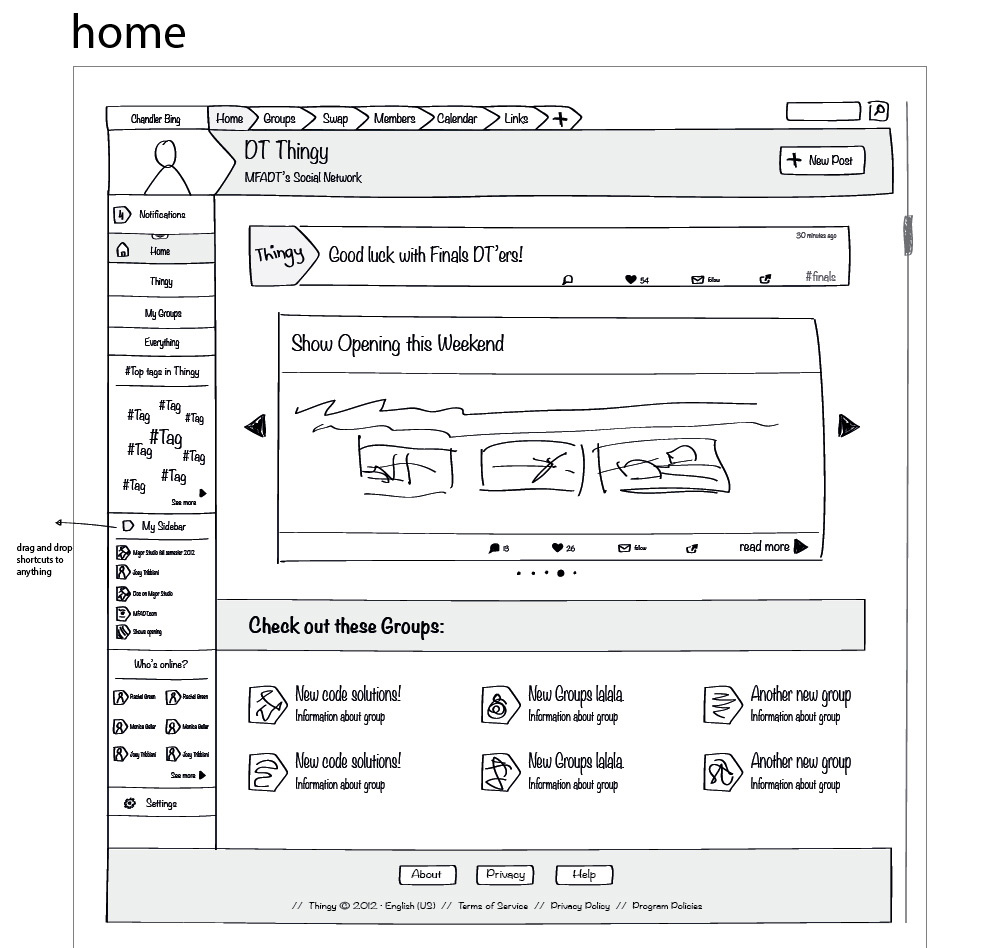
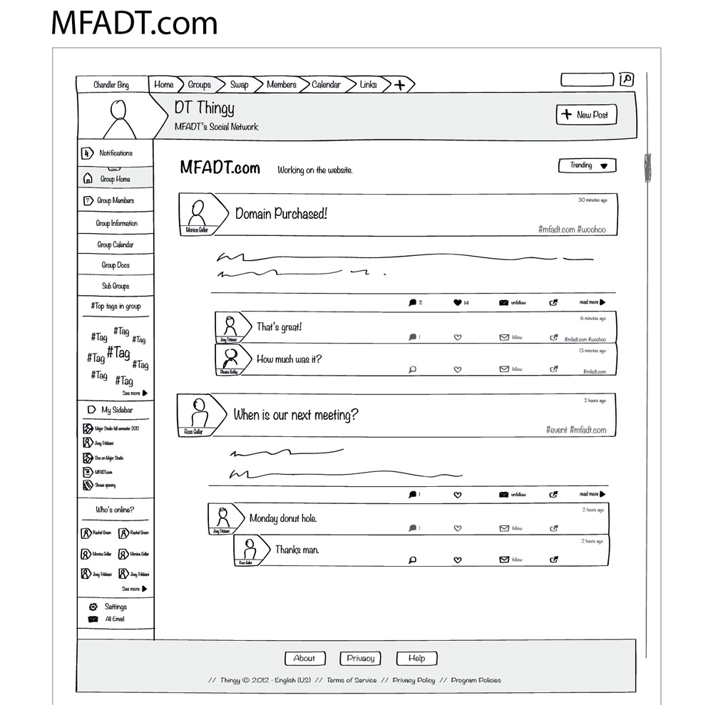
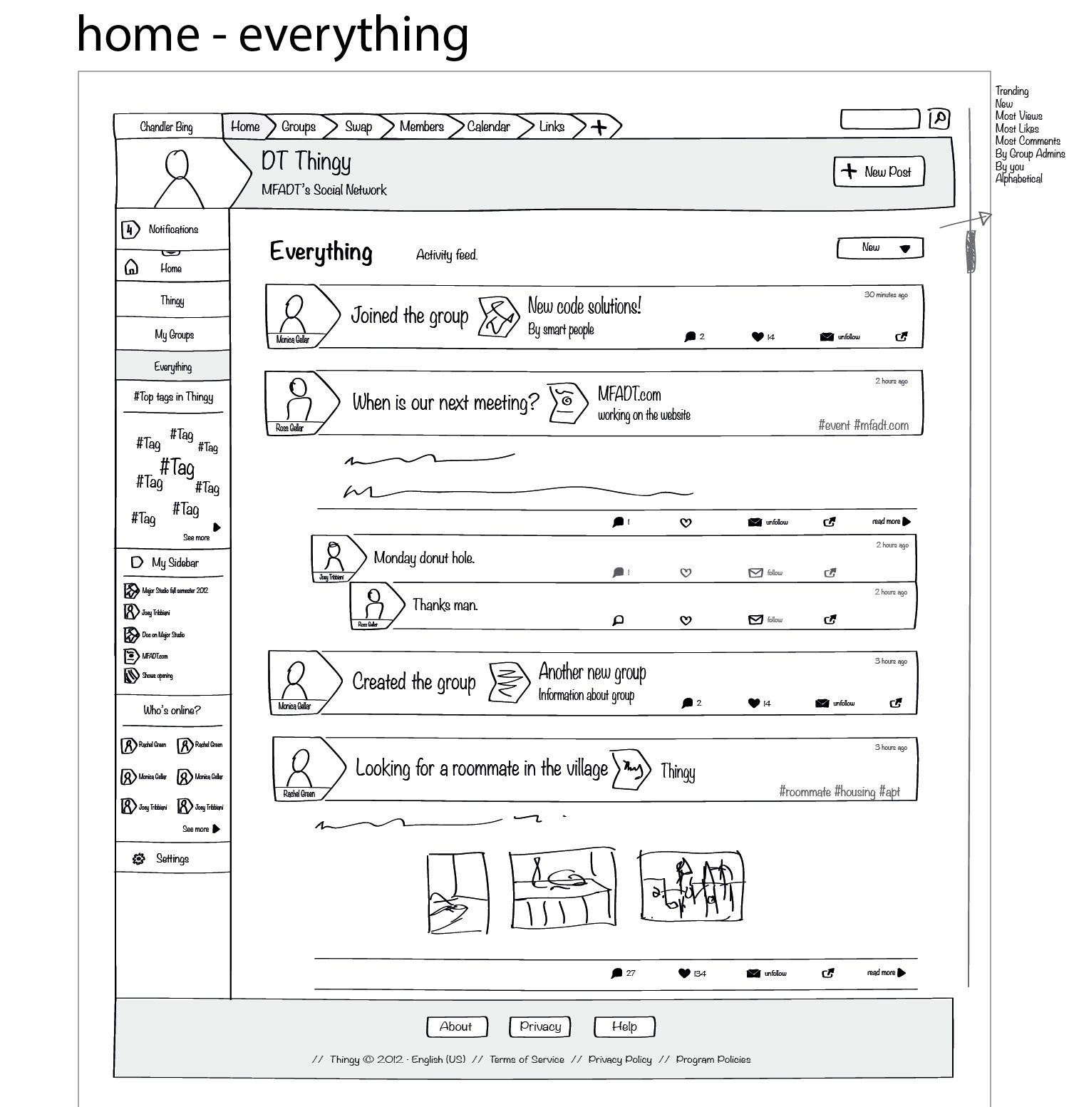
In my design, the social network has one main forum and many groups, in addition to a swap section and useful information such as links and calendars.
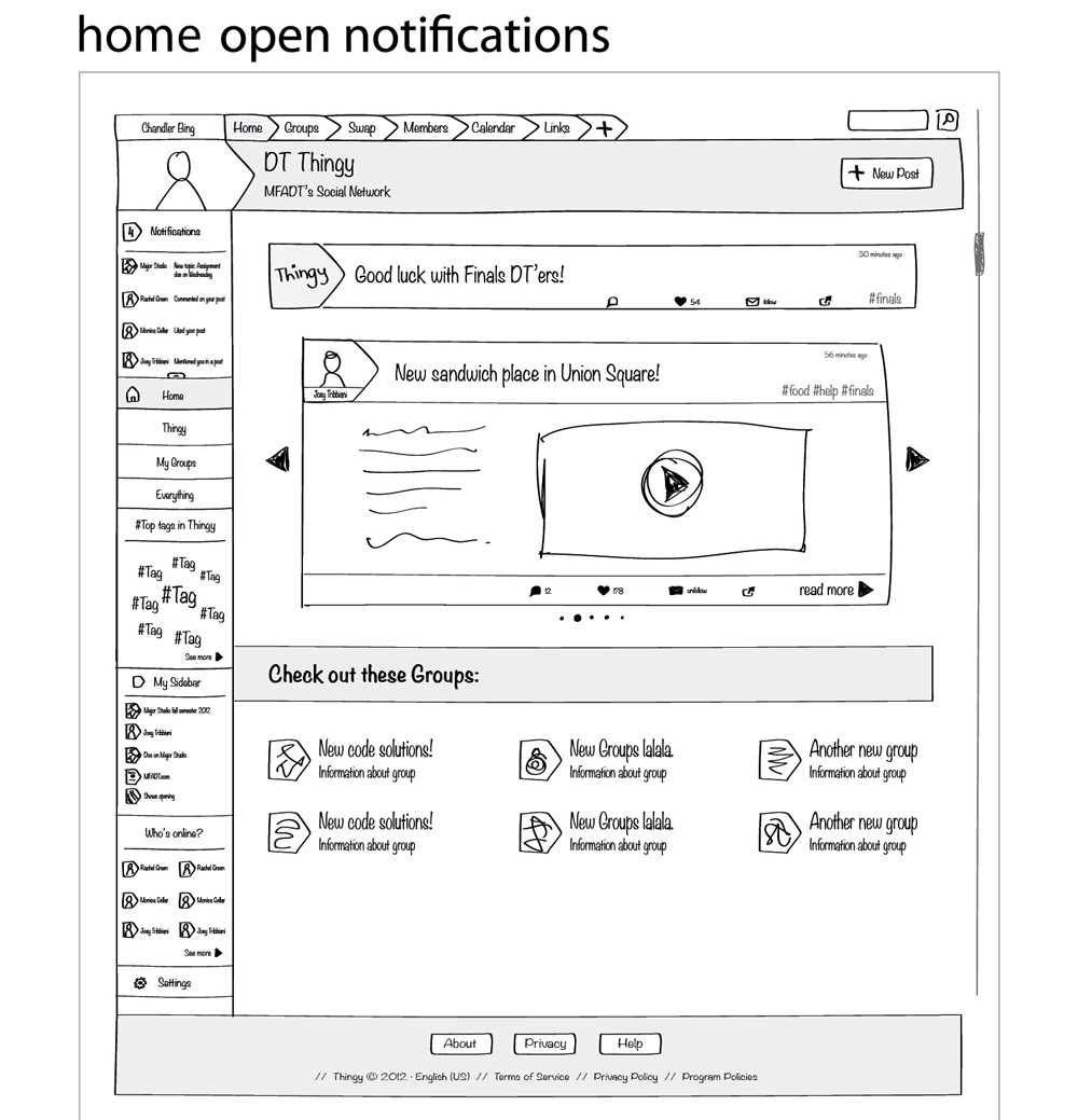
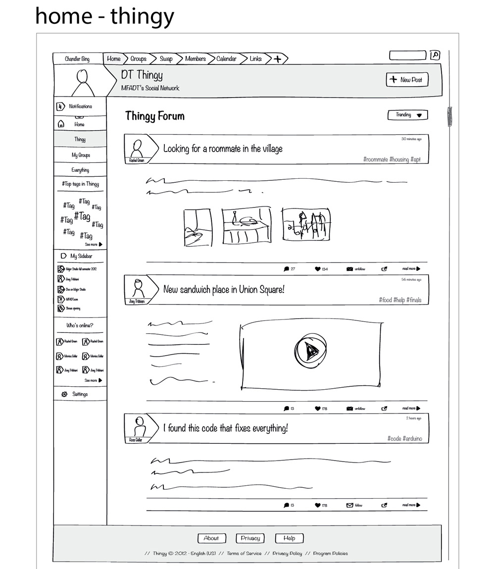
The main forum is where users can post general topics and address their fellow DT’ers. The posts are tagged, so that they can be grouped into categories and also be filtered by users via personal email settings. By pressing a button, each post can be unfollowed individually. A user can like or comment, this comment can further be liked or commented on and so forth. The information shown on the homepage is dynamic and ever changing, with popular posts and upcoming events featured, in the addition to helpful current information by the administrator. A mix of popular groups, new groups and administrator’s choice are also featured. Popularity is set by the number of comments, shares and likes.
Profiles
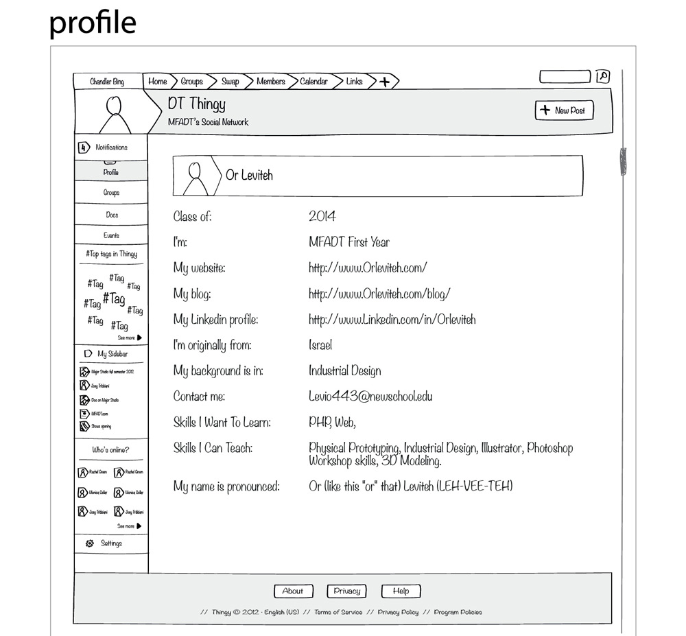
All users will generate their own profiles. A profile includes a profile picture, background information, links to personal websites, linkedin profile and so on. The profiles are searchable so that a user is able to find, for instance, someone experienced in industrial design or another one from Brazil, for that matter. The profile also allows clicking a keyword in order to see where else on other profiles this word is listed. These options will make it easier for DT’ers to get to know each other faster and find common interests, which is very important in a learning environment based on mutual help, such as ours.
The profile section will be specifically important when applied to the faculty as it will allow students to learn more about their teachers and make more informed decisions when it comes to choosing classes.
The structure of Thingy is one where next to each post appear the name and profile picture of the author, as is on Facebook and other social networks, making it easy for the user to recognize who is the conversation partner.
The profile section will also let the user list individual talents, skills and interests which later on will be used in the Swap section of Thingy.
Email Notifications and Interaction
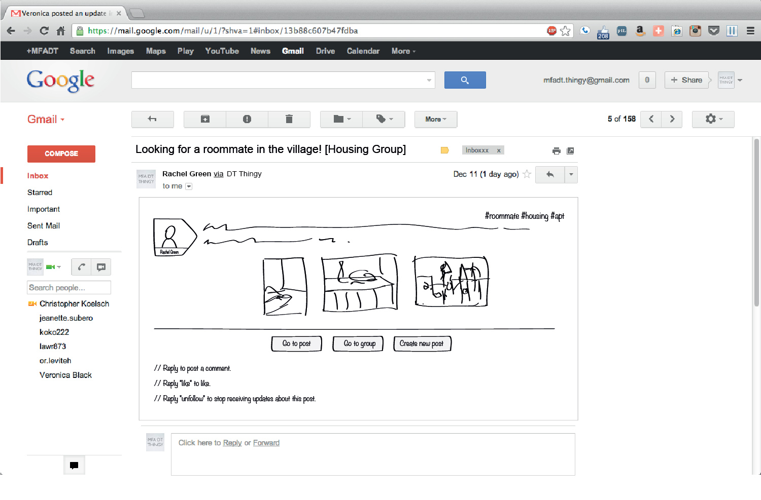
One of the most important principles of Thingy is to enable almost all interaction to be done, if necessary, by email, the way it is on Listserv.
I wish to enable the user of Thingy to comment on a post, like it and most importantly unfollow it, through email as well. This concept is led by the understanding that not all subjects and emails are equal in importance so that I want to provide the user with the option to decide in which conversation to take part or from which to withdraw. The default status would be to receive all of the continuing conversation, but to allow the user to opt out of it at any moment by replying “unfollow” to the email. The platform will be built in such a way that emails essentially are just a notification for a post made within the Thingy website. This way even a topic that has been unfollowed could be later viewed in full on the website, in a clear chronological way.
Groups
Another important aspect of Thingy is the groups. Thingy contains the basic groups that will facilitate all the Major Studios and Thesis Studios, the various Electives and Collaborative Studios and other student-based groups like Student Council, Petlab, Game Club and so on. These groups will allow the participants to easily communicate with each other without having to create a list of emails every time they wish to address all the members of a certain group.
Most classes make it mandatory to post homework and various assignments online. Each class has its own blog, usually one which was created by the teacher, unless the class uses one of the tools provided by the school such as Lore or Blackboard. Thingy will give a consistent platform on which all classes can have their own private space to share and post their assignments in one location. The platform will support all file types and will include a visual preview of links, images, videos and files.
More groups can be easily created to help members collaborate on joint projects, like Thesis Show committees, game testing and more. Already, groups of other common interests have been popping up on the Thingy prototype, mostly fan pages and funny things. By allowing one who is interested in a specific topic to join a group, and another who is not to leave it, the user can be sure that any message reaches only those who are interested in getting it.
In addition, each group has its own email preferences so the user can decide whether to get all emails, a daily/weekly digest, notices of new posts only or no emails at all.
Swap Section
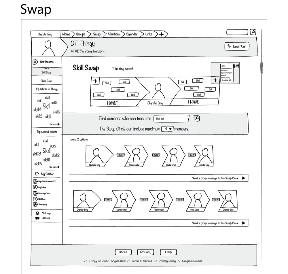
One topic that was originally raised over Listserv and then was brought up again in numerous council meeting was the need of some sort of skill exchange platform for DT. Those of us who live in D12 know there is a common and wonderful tradition of helping each other in times of need – basically everyone in DT helps everyone else when possible. The concept was to create some sort of a database in which people could search for specific skills or ask to be taught skills, and in return set up tutoring sessions for skills of different subject matters. This idea had been tossed around but hasn’t been picked up by anyone so I have decided to make the skill exchange a significant part of Thingy. My design for the skill exchange database is also appropriate as a class swap platform for which a need has already presented itself.
The principal of the swap section is based on two interactive boxes that the user gets to modify: an “I have” box, and an “I want” box. The I have box is for things that the user has, in this case, skills that he can teach others. The I want box comprises a list of all the topics about which the user would like to learn more. The skills will be auto completed on typing, so there is consistency in the phrasing of the topics. Users will fill out their talents, skills and interests and will be able to see those of all the others.
The user can then search for one skill or more for ad hoc learning and can generate automatic “swap circle” results. In case no one user was found to teach the needed skill and be reciprocated with a different one, the swap circle will find the relevant members who will tutor one another until all get to learn the skills they were interested in. The user can control the maximum number of members in the swap circle and when finding a suitable result the user can approach all the members in the swap circle by starting a group conversation.
The same goes for swapping classes – users list preferred classes and classes to be dropped, the search generates the swap circle, and everyone gets what they want.
Public Thingy Calendar
Another important part of Thingy is the public calendar. Currently there isn’t one place in which a student can see all the events going on in DT, be it show openings, guest speakers or final presentations. The public calendar is easy to use, so that anyone from DT can add private events to the calendar simply by creating said event in one’s own google calendar and sending an invitation to Thingy’s gmail account.
The calendar will make it easier for us to stay updated on events and will encourage us to have a look of other people’s projects.
Where to Go Next
I believe the concept of a separate exclusive social network for MFADT can provide a pragmatic solution for a lot of the department’s needs while creating a close and friendly environment to work and learn in.
It is my hope that the prototype of Thingy will be adopted by the DT community and will prove to be a useful tool. My intention is to keep developing the prototype and turn it into a functioning and popular social network, while acquiring the technical expertise I am still in need of.
I wish Thingy establishes a tradition of being passed down every year to First Years, who will continue to work on it and improve it. In my opinion, developing Thingy should be part of the Student Council’s responsibility and the student/s in charge of it should be credited accordingly as an independent study.
The next step for Thingy is to make it through the break. I already closed the community so it is now private. You now have to be logged in in oreder to view the content. Members can still register with their @newschool.edu and @alumni.newschool.edu email.
I want to stay on top of things and try to make sure that the Thesis Show committees have everything they need to be able to communicate from afar. I will push for the Studio groups for next semester to be used.
The MFADT.com website group will work during the break on the plan for the outword facing department website. We hope to create a sort of hub that will connect all things DT. “MFADT.com/Thingy” will be the closed social network just for us, and other parts of the MFADT.com will be open to all. We hope to promote our projects and shows and
give the outside world a chance to see what we do.
I have created a presentation with notes so that anyone can go over it and hopefully understand what the Thingy is all about. I want to have that information available to whoever is interested in helping out with the project.
I intend to meet with Dave over the break and see if the Thingy can get faculty support and help with a more stable server. Mine is already causing problems.
I was really excited about Melanie and Colleen’s advice and critic.
I intend to check out all the recommendations and inspiration that they mentioned:
• “Canvas” – learning management system.
• “Our goods” – barter network for the creative community.
• “Trade School” – barter for instruction.
• Clay Shirky about design for specific groups.
And others that I’m still trying to decipher what they were talking about.
I thought that Colleen’s idea to start a paper prototype for the skill swap at D12 is genius and started working on it. I intend to put it up at the beginning of next semester.
I will also make an attempt to create a “heart” for Thingy, yet I think that will take some testing over time to see which way the users are leaning.
I will also follow the progress of the prototype and see how I can encourage members to interact and share over Thingy. I think that the idea to have a “status” of member and to quantify the level of involvement in the Thingy is very interesting and I will furthur explore it.
I intend to stay in contact with Boone B Gorges, one of the developers of BuddyPress, who has been helping me along the way. I hope to work together in order to create features that are custom made for our needs.
Further steps for Thingy: building it according to the wireframe design which will provide all the functional aspects mentioned above.
When time comes and Thingy is implemented and working properly, creating a mobile app will no doubt be essential.
Though currently all we have is a simple prototype, once the idea turns into reality and the community accepts it, this platform can be built upon, manipulated and expanded into anything.
However, the acceptance of Thingy could be tough. The beginning will certainly be rather confusing because of the duality of services – both Thingy and Listserv – but I hope that Thingy will gradually take its place and eventually replace Listserv completely while ridding DT of the need to use Lore and Blackboard.
It is now two and a half weeks since the Thingy prototype was launched (December 8, 2012). It has 40 members that I hope will remain semi active during the break.
My hope is that in a few years I’ll find an exciting, innovative, ground breaking digital communication platform for DT that evolved out of the Thingy.
Created in the framework of Major Studio 1, fall 2012.

